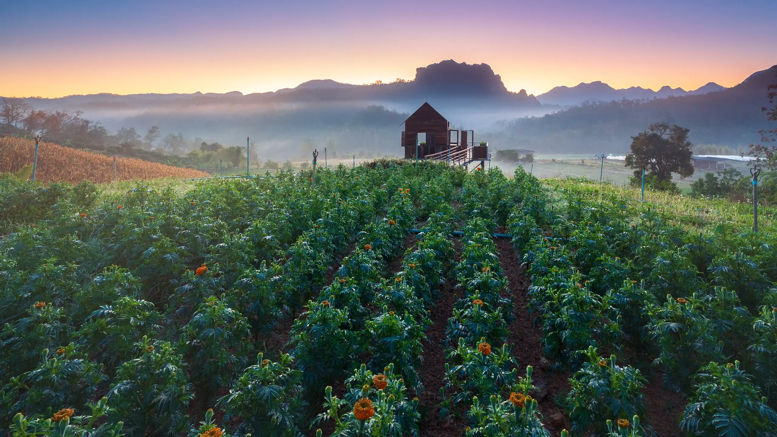
Restorative Farming in the South
The founders of Wild Daisy Farms connected with me through social media over shared interests in land stewardship, sustainability, and small-scale agriculture. Through early conversations, I learned about the farm they were building, the goals they held for it, and the challenges they were navigating as they brought it to life.
They understood that standing out in agriculture requires more than quality products. It requires clarity, trust, and a visible sense of purpose. They needed an identity that communicated who they are, what makes their approach different, and why their work matters, without adding unnecessary burden to an already demanding operation.
Farming is not an easy or fast path. Building a family farm from hard, untended land requires patience, resilience, and long-term commitment. The founders of Wild Daisy Farms held a clear vision and were actively working toward it. I was honored to partner with them in shaping how that vision would be presented to the world.

Identifying the need
Discovery centered on understanding both the realities of farming and the pressures facing small agricultural businesses. While there are opportunities for small farms to launch, building a sustainable operation without constant expansion or harmful practices is difficult. The identity needed to work _for_ the farmers, not against them.
The brand had to be flexible, legible, and practical. It needed to differentiate Wild Daisy Farms visually, attract customers without requiring constant manual effort, and function across packaging, signage, and market environments. Equally important was establishing a foundation that would remain useful as the farm grew.
In parallel, we outlined requirements for an e-commerce website that could support market schedules, communicate updates, and enable pre-orders, subscriptions, and cooperative purchasing. Squarespace was selected for its ease of use and native compatibility with their existing point-of-sale system.

Creating the solution
The project progressed efficiently from discovery into design, working directly with the owners to define their long-term vision, regional context, and visual preferences. Competitive research helped ensure the identity would stand apart while remaining authentic to the agricultural space.
Through focused workshops and clear communication, we aligned quickly on creative direction and expanded that foundation into a complete visual identity. The daisy became the core symbol of the brand, inspired by a real moment on their property when a wild daisy was found thriving in soil initially thought unsuitable for farming. It became a natural metaphor for resilience, care, and potential.
As the identity took shape, I developed priority deliverables needed for the upcoming spring market season, including market signage, printed materials, and digital assets. Based on workload and seasonal constraints, we agreed to temporarily deprioritize the website while the farm focused on production and in-person sales.
The work
What we made and how it came together
The outcome
The new identity was immediately effective, drawing attention, positive feedback, and increased engagement at local farmers markets. It provided the owners with a cohesive, confident foundation to represent their work and values publicly.
The website was completed shortly after, with ownership transferred fully to the founders. I provided guided instructional videos to ensure they could update content, manage products, and share their story independently. While the project concluded without an ongoing creative partnership, the relationship remains open, with mutual trust established for future collaboration as needs arise.
Image Gallery
Lorem ipsum dolor sit amet, consectetur adipiscing elit.