Healthcare in Rural America
The new leadership team at Mountain Laurel Medical Center were referred to me through a mutual connection as they sought to rebrand the organization to align with their new positioning. Built around providing care to underserved communities around my hometown, I was highly motivated to provide my services to ensure their brand was aligned with their mission and business goals.
The organization had been relatively sedentary in the community years. A small rural health clinic in an isolated part of the county, doing their best to help with the limited resources at their disposal. But limited resources, a few plans to keep up with the active efforts to whittle away healthcare resources in rural communities. The new leadership brought an expertise in raising funds through investment and grant writing to set the foundation for a full rebrand and local marketing campaign and a planned expansion of services.

Identifying the need
Discovery started with understanding the people Mountain Laurel Medical Center aimed to serve. Within rural communities there can often be an underlying distrust of modernization, especially within healthcare and medical services. Either they expect to not be taken care of by elitist clinicians who look down on them and don't provide real care, or that there must be a catch that will come in the form of an extortionary bills after being promised "affordable care" as has become the expectation of most medical care in America.
So that became the first challenge that had to be taken into account with the rebrand. While the visual identity needed to be modern and align with the organizational goals, it also needed to clearly reference the local community in a relatable and aspirational way. The second challenge was that this rebrand and resulting marketing campaign needed to focus on targeting the local population to make sure those who were underserved were made aware of the new services available. The challenge being that this means turning the clock back on what marketing campaigns ser supposed to be. Newspapers, flyers, direct mail, radio ads, and a variety of other platforms that are becoming less used.
Scope and budget were refined and agreed on through multiple meetings with the new Marketing lead and a variety of stakeholders within the new leadership team before we kicked off the project. Together we set about building a foundation to launch the revival of an organization that would become a top provider of medical services for the aera that needed it most.

Creating the solution
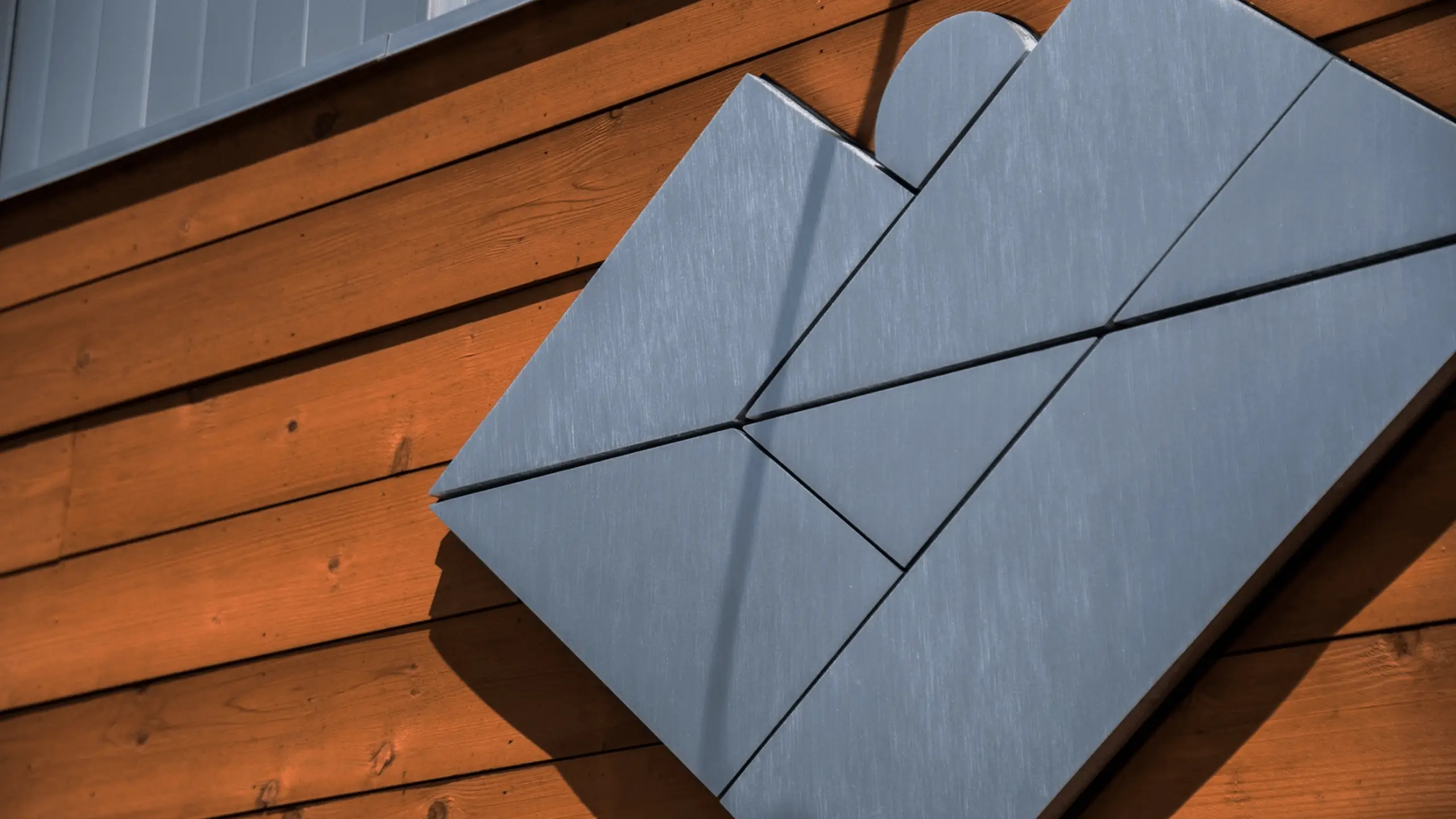
The creative I developed for Mountain Laurel Medical Center had to be focused on being an identifiable and trustworthy mark within an underserved rural community. To do this I drew on the land I knew so well, and created a logo pulled the mountains and lake that make the beautiful, tourist attraction at the center of the community. Deep Creek Lake is a center of economic development for the county, with businesses and services that employ many in the area, growing around the tourism that is built around the beautiful lake.
All visual identities have to be built with the consideration of every reasonable application of it, internal and external. This means designing patterns and shapes in the brand kit that were specifically designed to be as at home on a website as they are on a vehicle wrap or newspaper ad. During this phase I created a powerful icon that lent itself well to a modern geometric style that checked the boxes of everything the client was hoping it could be.
I developed brand standards and usage guides for their internal marketing staff to use as they implement the brand through their various channels. We worked collaboratively to ensure this was a valuable and helpful guide, not a prescriptive restriction.
Through this phase we had multiple scheduled checkpoints to work collaboratively through the development of the visual identity and the necessary templates to empower their team to deliver on the mission set before them.
The work
What we made and how it came together
The outcome
The end result of my work was an identity that elevated a revitalized organization and empowered them to achieve incredible growth. In the years that followed, Mountain Laurel Medical Center completed construction on a massively expanded primary medical center and opened three additional clinics around the region to offer vital services to more people in more communities.
A crafted visual identity tied to a strong brand with a powerful mission has proven to be an incredible success. Mountain Laurel has grown and expanded to new heights and are still working ambitiously to provide vital services to the underserved communities that have, after time, given them their trust.
Image Gallery
A collection of deliverables created to carry the mission in the local community.